Week six of Eyes Align: The final post

In this post I will shortly discuss the thumbnail for eyes align, as well as the title page.

TITLE PAGE: ”NOT TOO FLASHY BUT ALSO NOT BORING.” ”MAKE IT RETRO.” ”NO, MAKE IT IN THE SAME STYLE AS THE REST OF THE GAME.”

As the subheader not so subtly alludes to the ideas were plentiful and nothing was decided. I made three basic concepts for the title page which were then intended to be adjusted to siut the preferance of the group.

Number one: The sleek look

start1

The first and simplest one. A silver logo struck by a bright, blue flash on a black background.

Number two: Space is neon and there are clouds and stuff

startscreen3.2

This is basically the same as number one but with the addition of stars and… clouds? I don’t know. I drew it but I don’t know. I just wanted a splash of color.

Number three: The hipster one

startscreen1retro1

This is the crowd favorite, and probably my own as well. I was going for a retro feel and I think I did alright.


THUMBNAIL

The thumbnail was tricky as it is a small picture that is supposed to give people their first impression of the game while being very tiny and not including a logo. With this in mind I put the eye from the logo on some spacey background and threw in some camera flash for good measure. Somewhat tacky but I like it.

thumbnaild

Week six of Eyes Align: The final post

Week five of Eyes Align: Git gud

At this point, which was in fact not at all week five, I was actually starting to create some pretty decent backgrounds. I was more or less figuring out the lighting, texturing, composing.

coffeecorridordonedronehangarvendroids

I was using the texture brushes sparingly and in a far less obtrusive way. The spaces also seemed far less empty and soulless. I like these three paintings. I’m still no Da Vinci but in my own opinion the difference between these four and my earliest drawings is so huge that it’s hard to think they were made by the same person.

Week five of Eyes Align: Git gud

Week four on Eyes Align: Logos OR eyeballs eyeballs eyeballs everywhere!

We were reminded that our game was in need of a logo and I, at this point fairly tired of drawing backgrounds and starting to worry about my mental state, volunteered to design it. We already had the title: Eyes Align and so I thought it only made sense to have a logo with an eye in it. I started out with a fairly unimaginative stylized eye:

aiaiaiaiaiaai

then I made it a bit snazzier:

eye.png

That didn’t really work as a logo though and we needed the actual title to go with it, so I started thinking simpler:

l2.2.png

Boring. Snazz it up:

logofini.png

Much better.


Week four on Eyes Align: Logos OR eyeballs eyeballs eyeballs everywhere!

Week three of Eyes Align: Not sure if actually week three, but I’m in too deep with the matching titles

Some of the backgrounds I created in the early stages are nowhere near as good as some of the latter ones. One of the less good backgrounds I made is this one:

alienstationapartmentswqa.png

It’s lacking in texture, depth and personality, but in my defense I was doing my best to learn and just figuring out the angles and layout was hell on its own. All pictures were made in pretty much the same way: digital painting in Krita, occasional use of texture brushes and the rare google search where I found reference pictures to rely on since I didn’t have the time or energy to come up with their look (for things like the magazines and the mask)

Week three of Eyes Align: Not sure if actually week three, but I’m in too deep with the matching titles

Week two of Eyes Align: Jumping into the deep end without floaties

Joining the team was the easy part, now I had to actually produce backgrounds of the quality they expected ( and I expected of myself) quickly. About three backgrounds per week. The first thing I drew was the city street outside Celia Grey’s apartment.

alienstationstuffwrain2.png

As can be seen, I relied fairly heavily on texture brushes in the beginning, such as the brickwork and some of the metal details. Other than that it was fairly basic: I googled pictures of how a city street looked like to figure out the approximate composition, then I painted it in Krita (a program similar to photoshop.) I started by drawing up the basic shapes, then adding texure, and finally adding color. The picture proved to be too city-like and too similar to a modern city, due to my use of brick and fire ladders mostly. I later made newer (and hopefully improved) versions of it, with the final version looking like this:

streetwcar.light.png

I changed the texture on the walls, added some things, and generally just messed around with it until we ran out of time were happy with it.

Week two of Eyes Align: Jumping into the deep end without floaties

week one of Eyes Align: Figuring out the look

Before I even officially joined a.r.c.o. I drew up some sketches and some cleaner pictures to figure out a middleground for the rest of the team and myself in regards to what kind of art I would be doing. At this point I am unaccostomed to drawing/ painting backgrounds as well as sci-fi, so it was a bit tricky. After a few days I sent them this picture as an example:

mockupalienstation.png

They liked the look for the most part but the environment was not quite right. Anyway, after looking at this and talking a bit about the game, its story and what we wanted to do, we decided to team up. Thus I joined a.r.c.o. and my days of ripping my hair out trying do figure out how do all this began.

week one of Eyes Align: Figuring out the look

A happy little missile, next up: Mighty explosions!

Hey ya’ll, shocking as it may be, I will not be writing about bugs in this weeks post. I know, it saddens me as well.

I am a little unsure about what to write in this weeks post as I have mostly worked on effect sprites and done the whole handy man routine. In other words I have been all over the place and done a bit of this and that here and there.

As you may guess or perhaps know from personal experience, is that while effect sprites and animations, while necessary for the game to get the right ”feel”, are so incredibly boring to talk and read about that it might just drive an otherwise sane person to make unwise decisons, such as wasting a large space in their blog post with senseless drivel, or write ridiculously long sentences about said fenomena. It is a scary world we live in, amigos.

All that aside, I guess I will start on, you know, writing about the actual work that I have done. I will just go with talking about the least boring thing I have worked on during the last couple of days, and that would be this baby right here:

missile

This, my dear friends, classmates and possible random people who had the unfortunate fate to end up on this blog, is a missile. It is a weapon that the ship, that you as the player control, can pick up pretty early on in the game. While you do start out with a basic gun, the missile is five times more powerful and allows you to One Hit Kill pretty much any enemy that you encounter during the level, aside from the final boss of course.

My goal while drawing the missile was to:

-make it look like a missile

-make it look like it suits the Aquila (the ship), using color and the like

-make it stand out enough in the enviroment in order to allow the player to follow its course

-not make it look too flashy or ugly

All things considered I feel rather pleased with the missile. It is not the most exciting thing I have ever worked on, but one can not always get fun and challenging tasks. Sometimes you just have to draw a happy little missile.

Bea out

A happy little missile, next up: Mighty explosions!

I’m hot cause I’m fly(ing)

Hi there, neighbor and welcome to yet another post about big bugs in space caves. Writing about animating bugs is slowly but surely becoming my jam, though in this post I will focus foremost on the design choices.

Honestly, this week has been somewhat uneventful. In order to spare you from reading all about how I messed around with SFX and played weird arcade games (for research purposes… well, sort of) I will instead write about something which I did most of in the past weeks and just kind of tweaked this week. Enough dawdling, here goes:

This, as you can hopefully see, is a mean bug. To be more precise it is my stylized interpretation of a yellowjacket, which is an insect in the wasp family. It is also the concept art of the main aerial enemy in our game.

yellow-jacketxknlklcnu

…but it didn’t feel quite right. I played around a little with the pose and for good measure I gave it glowing red eyes rather than the black with a red sheen that adorned its predecessors head.

yellowjacketattack

It was better.

We required aerial enemies and as usual when I feel inspired to work within a theme that I’m not particularly accustomed to, in this case insects because ew, I turned to google and wikipedia. Of all the flying creepy crawlies I came across I thought the yellowjacket looked the most dramatic and mean, so obviously it was my first choice for the aerial enemy.

The above drawings were square one. From there I went on to draw it how I wanted it to look in game:

yellowjacketf1

As you can see it is far simpler than the concept art, because let’s face it, the concept has way too many details and too little contrast to work in game considering its intended size. So I tweaked my original and changed the pose a bit more.

After that I made the frames for its basic movement animation:

yellowjacketsheet

I did my best to make the movement seem… “alive.” I wanted the wings to look soft and delicate in contrast to the rest of the little murderbug which is quite hard looking with it’s hard lines and sharp corners.

…and then I made its attack animation:

yellowjacketattacksheet

I made it a little bit blurry when it attacks in order to give the feeling of speed.

I struggled quite a bit with the ranged spider, and I believe that I have that to thank for the fairly painless experience while working on the yellowjacket.

Anyway, that’s it for this week,

Peace out!

I’m hot cause I’m fly(ing)

Itsy Bitsy Spider 2: Eight legs, daisy dukes, makes an animator go whoo-whoo

As I mentioned in my last post I’ve been working on enemy design and animation during this project, I also mentioned that I was… unhappy with my creations. I have however started to figure things out (more or less) and while I’m still amateurish to say the least I’d like to think that the results of my efforts have somwhat improved in quality. It’s no longer abominations anymore, it’s just kind of bad.

Complaining and self criticism aside, I should explain what I’ve been doing as of late, so here goes:

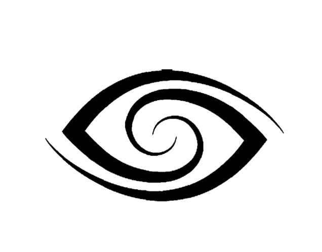
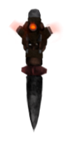
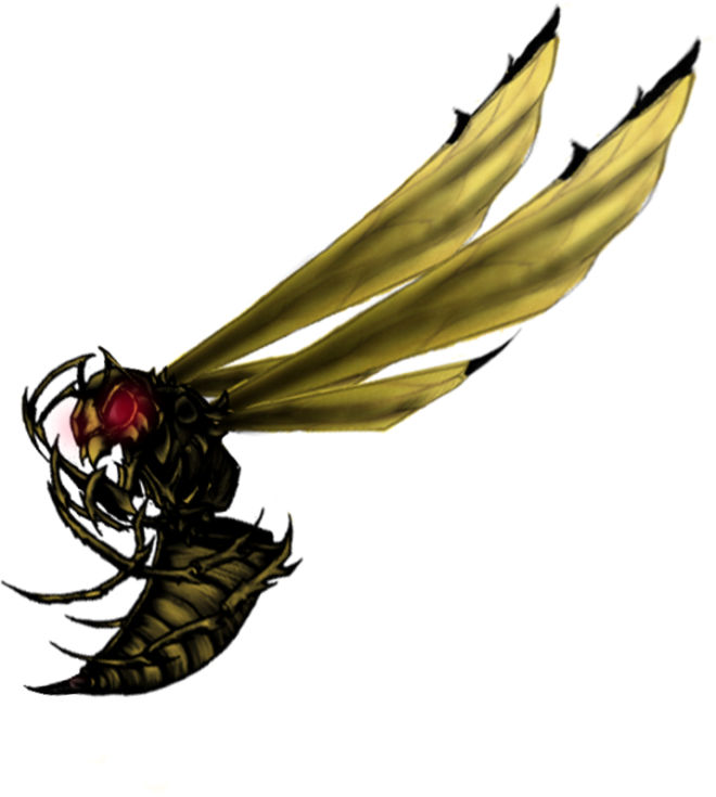
I’ve continued with the enemies, putting most of my focus on the ranged spider, the design of which I have changed a little based in part on feedback I have recieved and in part on my own tastes. Here’s how the ranged spider currently looks:

spiderf2

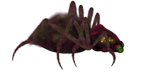
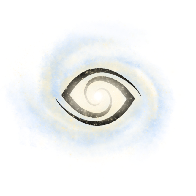
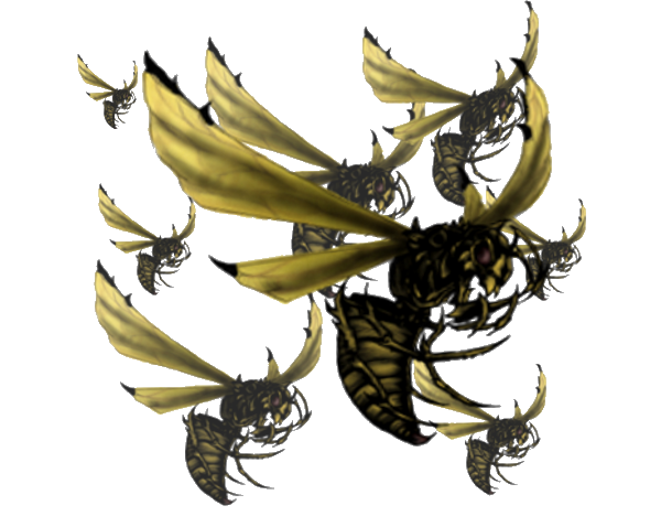
It’s not going to win any beauty pageants, but it’s better than this monstrosity:

Spider

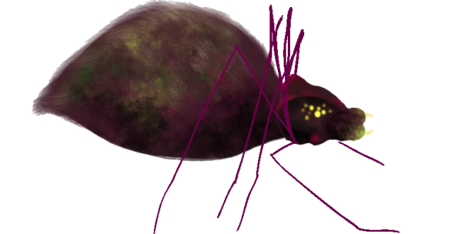
Of course I wasn’t planning on actually having it look like this in game, it was just a rough draft that I used while practicing animation. Still though.

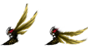
The movement animation for the ranged spider is completed, as is the death animation and the attack animation. I opted for rather simple animations using less frames than I had in previous (and hilariously failed) attempts. This is because

a) for some reason it looks less… stiff.

b) it gives the ranged spider a, in my opinion, more charming and retro feel.

c) honestly? I’m a little bit lazy. Mostly it’s because of the first two reasons though.

During the last 2-3 weeks I’ve tried out, oh, about ALL the animation programs (at least the ones with free trials, I’m not made of money.) while trying to figure out which program worked best for me and my little murderbugs. I also talked it over with some of my group members, checking what format was required and whatnot. My conclusion was that

a) I freaking hate animating and I’m terrible at it.

b) I did not have the time to learn new programs everyday only to try a new one the next.

c) Each frame had to be a separate PNG. anyway so it’s not like I actually need to use a program made for animation for this particular job.

d) I seem to like making lists, but only in the context of a blog apparently.

Taking the first three points into consideration I decided to just go and use a normal program for drawing and draw each separate frame as a new file. This resulted in a far less frustrated Bea and slightly prettier enemies. Of course this won’t work in the long run, but it was the best I could do in the given situation.

Peace out, hombres

Itsy Bitsy Spider 2: Eight legs, daisy dukes, makes an animator go whoo-whoo

Itsy Bitsy Spider

Spider

Our current assignment is to create a game based on another group’s concept, in our case we are working on Colussus Core, originally put together by Group 15.

This particular week I’ve been working on animation of enemies (of which a still can be seen at the top of this post.) Seeing how animation is really not my forte and I haven’t actually worked with it in depth for years, it was, or perhaps I should say is since I have yet to produce anything that isn’t just the worst, quite a challenge.

This enemy falls within the categories of Minion> Ground Type> Ranged. It moves along the walls of the cave and shoots its venom at our avatar, the ship Aquila. The Ranged Spider is the first enemy one will come across while playing Colussus Core. They are, as mentioned, a minion type enemy and are thus fairly weak compared to the challenges the player will meet later on in the game. The Ranged Spider is a recurring enemy and various versions (all mostly the same, following the same behavioral patterns) will appear in several different levels.

Regarding the design I pretty much just figured that:

  • It lives in a cave and spits goo, so a spider makes sense
  • It’s venomous> in nature bright color= venom/poison> bright colors make sense
  • It should still be able to blend into the dark caves a bit for added creepiness, so it can’t be too brightly colored
  • The ship was designed to have fairly cold colors, ex. cyan, gray, blue, cool brownish tones, while the cave was supposed to mostly be brown, yellow, and black, so going with a mostly purple/magenta enemy seemed like a good idea in order to keep the game interesting to look at despite being quite dark
  • Glowing eyes are creepy so let’s go with that
  • Added bones/growths on the skull makes it look more aggressive

I’ve mostly used Toon Boom Harmony for animations as it’s, well, the program I first decided to try out (it was recommended during a lecture) and there were a fair share of decent tutorials for it. It’s worked fine and whatever problems I’ve come across have most likely been the result of my lack of skill and experience rather than the program itself. Hopefully I’ll figure out how to animate a spider without it looking like an affront to whatever you believe in before this time next week. Hopefully.

Itsy Bitsy Spider